SaaS Comparison Chart
A SaaS comparison chart template for comparing CRM, scheduling, billing, automation, inbox, and reporting capabilities.
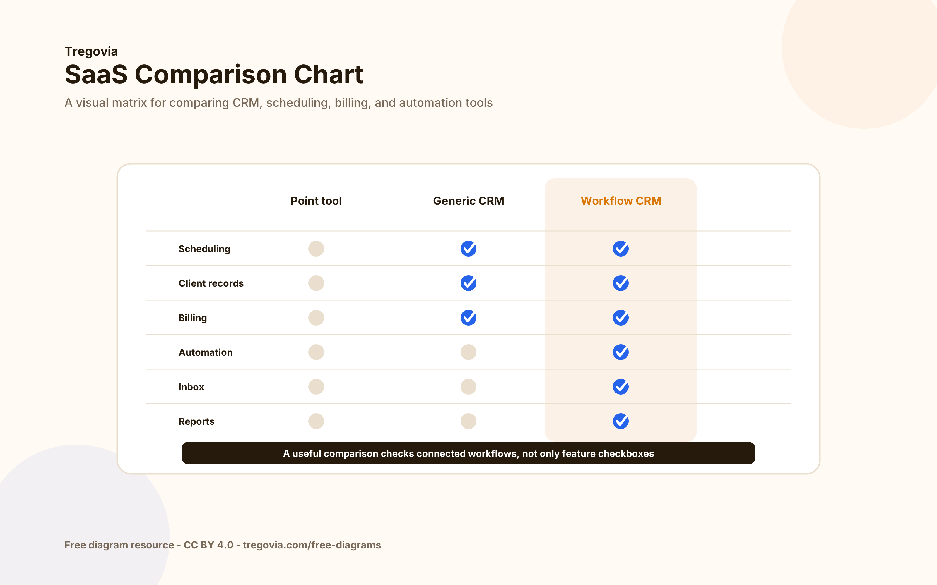
Diagram context
What this workflow explains
SaaS Comparison Chart is built for content around saas comparison chart, crm comparison, software comparison.
What does this comparison charts diagram show?
A SaaS comparison chart template for comparing CRM, scheduling, billing, automation, inbox, and reporting capabilities.
Where should SaaS Comparison Chart be used?
Use it in articles, docs, presentations, and comparison pages that explain saas comparison chart, crm comparison, or software comparison.
Why use an SVG diagram for this topic?
SVG keeps the workflow readable at different sizes, which makes it useful for technical guides, SaaS explainers, and embedded resource pages.
Diagram details
- Alt text
- SaaS comparison chart with CRM features compared across multiple software options
- Source URL
- https://tregovia.com/free-diagrams/saas-comparison-chart
- Tags
- saas comparison chartcrm comparisonsoftware comparisonfeature matrixcomparison table
Embed code
Use this attribution link near the diagram or in your credits section.
Preview
Diagram by TregoviaRelated free diagrams
CRM Workflow Diagram
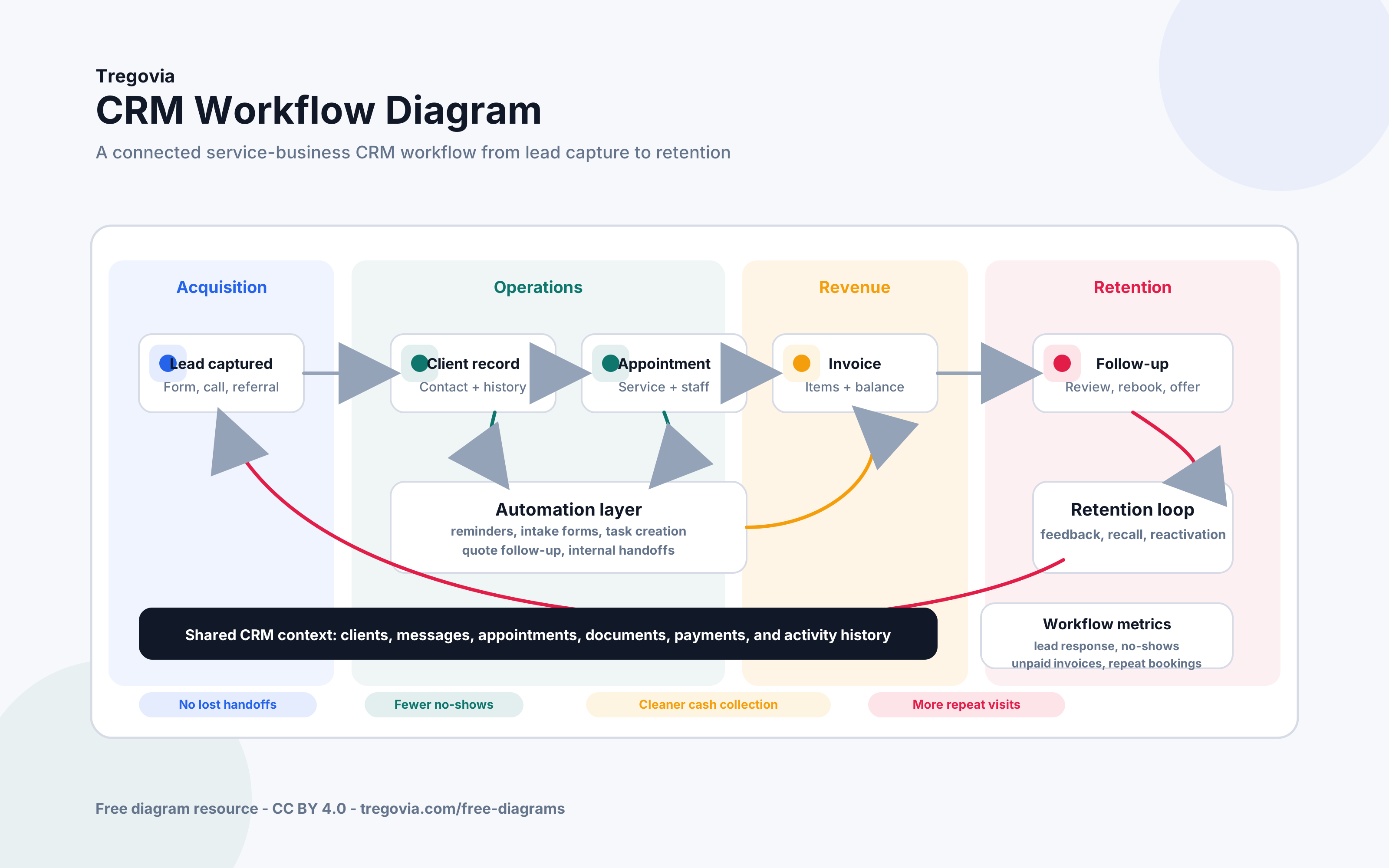
A CRM workflow diagram showing how a service business moves from inquiry to client record, booking, service delivery, invoice, and follow-up.
Customer Journey Diagram
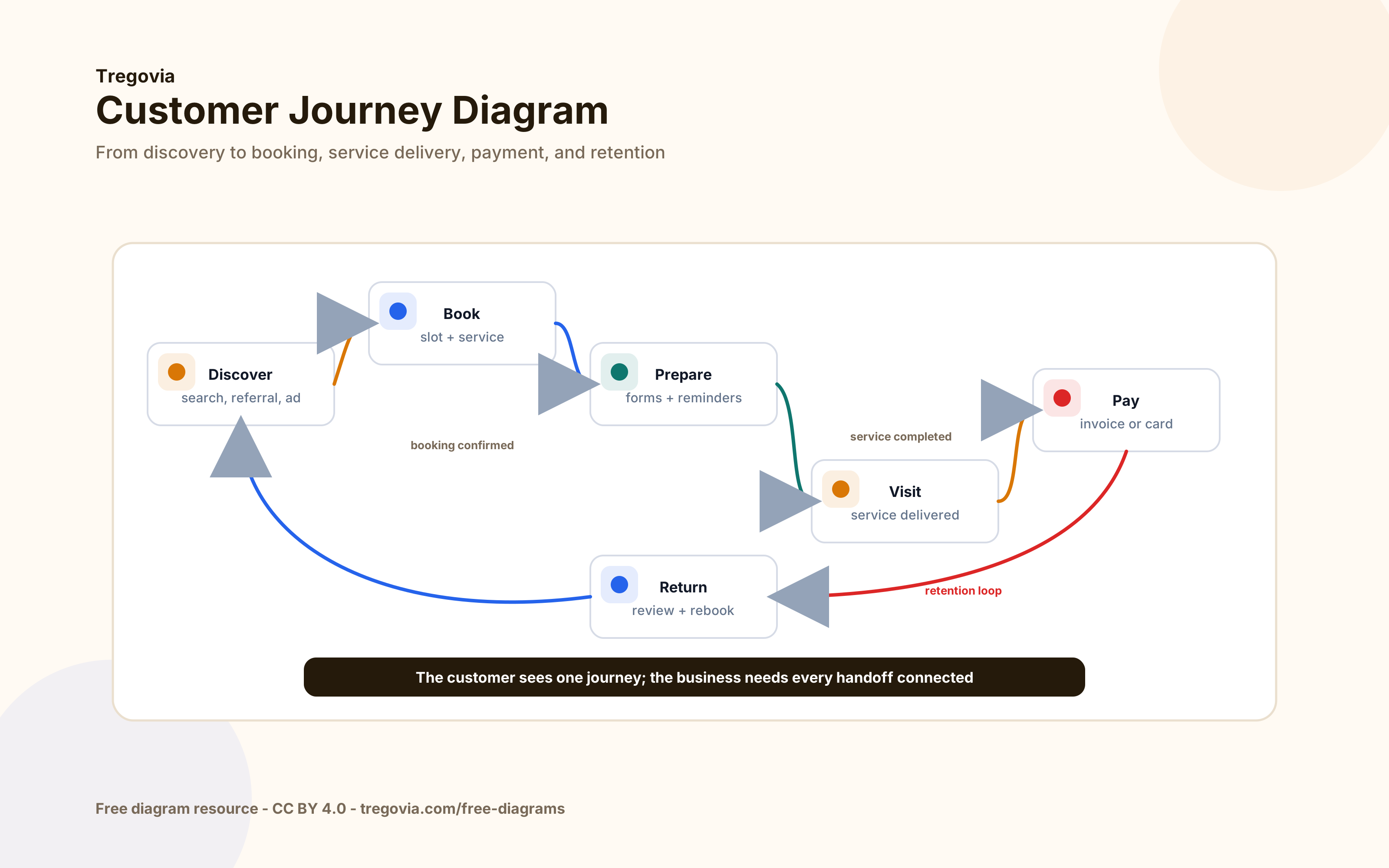
A customer journey diagram for service businesses, covering discovery, booking, preparation, visit, payment, and retention.
SaaS Dashboard Layout Diagram
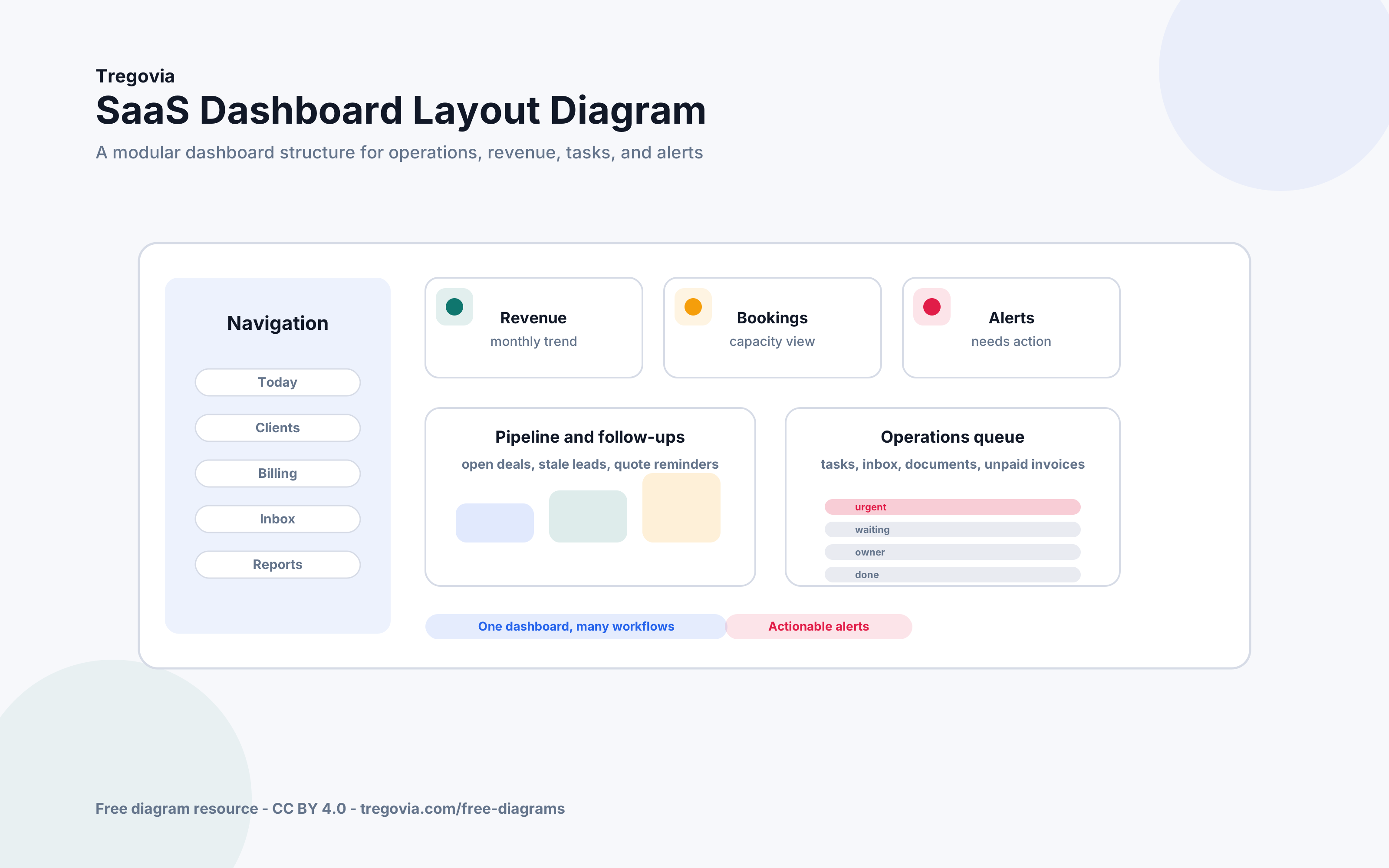
A SaaS dashboard layout diagram showing navigation, revenue widgets, booking metrics, alerts, pipeline, and operations queues.
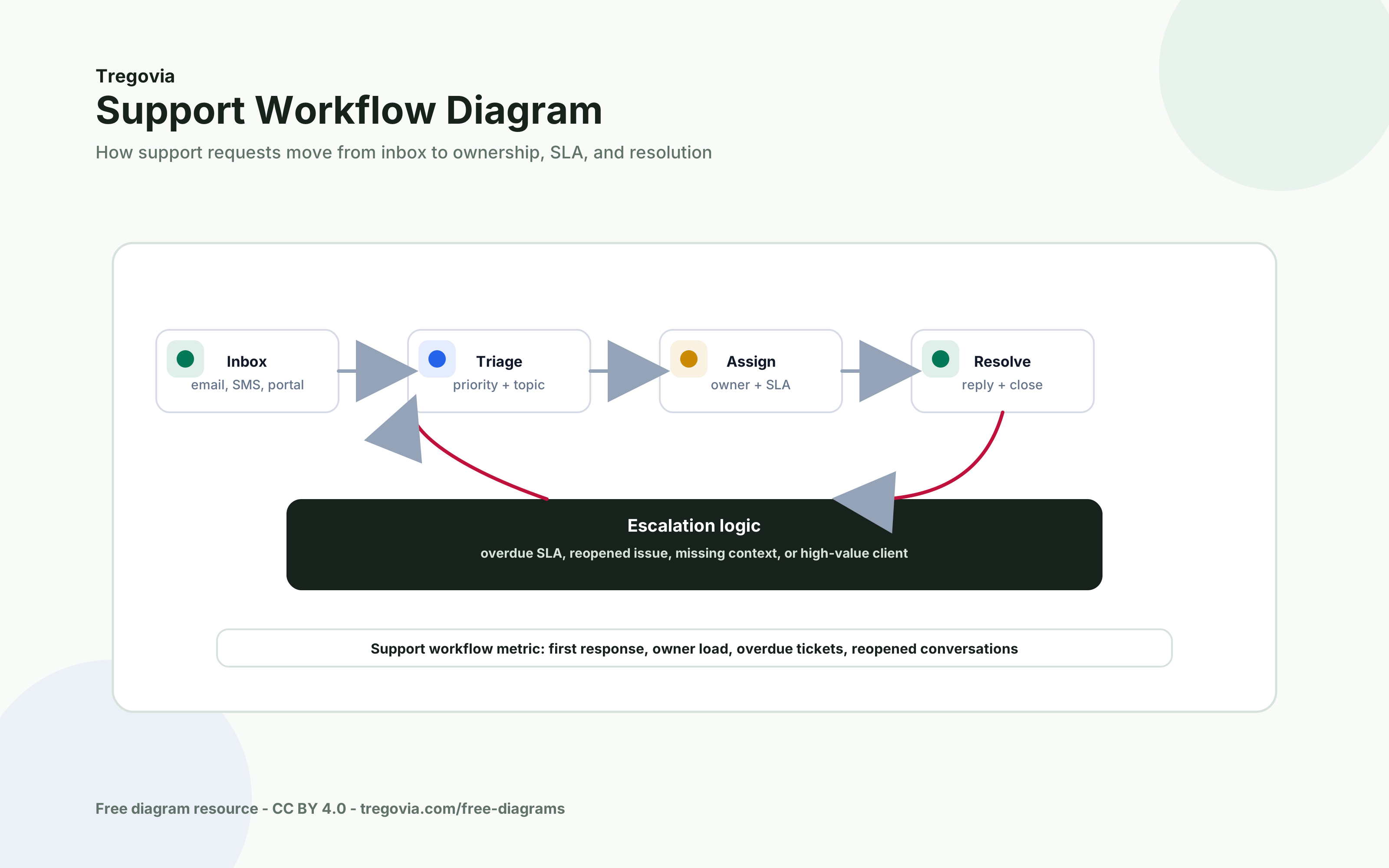
Support Workflow Diagram
A support workflow diagram showing how requests move from inbox to triage, assignment, SLA handling, resolution, and escalation.
Compare software by the workflows it actually connects
Tregovia brings scheduling, client records, billing, inboxes, automation, and reporting into one platform for service businesses.